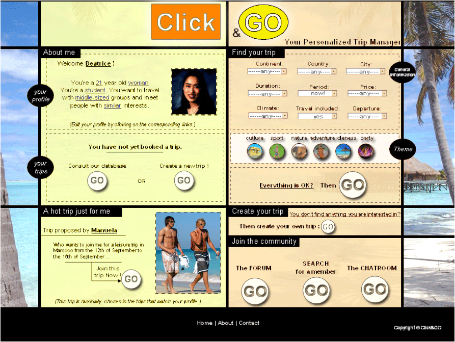
STUDENTS' Comments
Economical usage of colors (weight 20/60)
Give some arguments why the use of color in this design is not most
judicious?
Because these colors are too much saturated, they are too strong. When you arrive on this webpage, your attention is focused on the color instead of the content of the page. These colors give the sensation of being aggressed. The only thing that we would do when we see the page is to leave it. According to ?°„Color-Wheel-Pro.com?°¿, dark orange can mean deceit and distrust and dull yellow can represent caution, decay and sickness. Well, this is a bad choice of colors for a website that would provide holiday, sun and fun.
What would you do differently?
We would use less saturated. For example we can imagine that we would use light yellow instead of dull yellow. Light yellow is associated with intellect, freshness, and joy. And instead of dark orange we would use gold orange which means illumination, wisdom, and wealth. Gold also symbolizes high quality. These choices would make the visit of this website more pleasant and less aggressive, especially when the main visitors population is made of women and young people.
Background & foreground graphics (weight 20/60)
Give some arguments for why users might not like the background & foreground graphics?
There is no background graphic, the website does not creates any mental model when we arrive on it. Without reading, it's impossible to tell that this site is selling travels. The images, the buttons, the titles are all black or very dark. This is not a judicious choice of colors for a site that promotes vacation for youngsters who are looking for something more jovial and festive.
What would you do differently?
We would probably use light blue (or an discreet image) for the background which can represent the sky and the departure. For the titles, we will attract the eyes of the users with orange and yellow colors to represent the sun and a hot temperature. For the text we?°•ll probably use a black color and we?°•ll also put jovial images with colors.
Color contrast (weight 20/60)
Give some arguments for why users may not appreciate the color contrast?
There is nothing that really pops out from this webpage. Everything has the same value
range, there is no element that is stronger than another. According to what we said about
colors above, the contrast between text and background color is too low (because of dark colors of background and black text), it makes the reading not pleasant. There is no main
point of interest where eyes can focus on, so this webpage looks very flat and annoying.
Finally, the designer used the same graphical language to represent ?°„Go?°¿ as a button and
as a graphical element (in title). They are not same objects so they should be different.
What would you do differently?
First of all, doing all the things we mentioned earlier about colors values will fix the text
contrast problem. Then, it could be great to change the title to make it pop out from the
page, it will also create a point for the eyes to focus on. Then the buttons ?°„Go?°¿ and
?°„Theme?°¿ could have their color changed to make them different from the texts. We
cannot distinguish well what is graphical element from what is a clickable button.
All those modifications will surely improve the overall contrast, they will make the page
less flat and much more attractive. Eyes will be guided trough elements.
Redesign
According to all what we said above, we redesigned the website. Here are the main modifications we made, trying to keep our four basis colors (white, black, yellow, orange): °ßC Changing to more less saturated colors for background colors °ßC Adding a background picture of a beach, it helps creating the mental model and it is appealing °ßC Changing title colors to make it pop out from the page and appeal to travel (with sunny and hot colors) °ßC Changing ?°„Go?°¿ buttons color to white so it is different from the text. °ßC Changing the background color of the theme buttons to white: it helps thinking that those buttons are clickable °ßC Adding a picture of some nice guys on the beach. Our main audience are women here ;)
Teacher's Comment
Economical usage of colors:
Excellent analysis. Comments from the teacher: I found the use of two background colors still a bit heavy. If at all, they should be two-tone gradient colors.
Background & foreground graphics:
Excellent. Changing the picture to some nice guys was a good trick. The background graphics crowds the UI. A smaller portion of graphics would go even better. You may achieve better visual effects if your "go" buttons were rendered in the same color as the logo (again visual effects). The use of white color in the theme has no justification.
Color contrast:
Very good. One comment: why maintain the two-colored layout? There is no structural reason to create two visual columns.